Big Data Chart
Big Data Chart is a chart visualization used for Snowflake models (whereas the in-memory chart is used for the in-memory models). When a Snowflake model is selected, Big data charts can be added to dashboard in the tool palette by clicking the Chart icon. Snowflake-powered calculation will enable practically unlimited scaling when the amount of data and number of users increase.
Measure aggregations
When adding measures, an aggregation needs to be selected, defining how each row (e.g., case or event) within the dimension is aggregated into the final measure value. Available aggregation methods depend on the type of data to be aggregated. Following aggregations are available:
- For numbers: average, sum, minimum, maximum, median, percentile, standard deviation (population), standard deviation (sample), variance (population), variance (sample)
- For textual data: count of unique items, alphabetically first item, alphabetically last item, list items, list unique items
- For dates: earliest date, latest date
- Booleans are aggregated by calculating the number of true values.
For the percentile aggregation, the percentile value between 0 % and 100 % needs to be selected. Actually, 0% is the same as the minimum value, 50% is the median, and 100% is the maximum value.
For the list and unique list aggregations, the separator between the listed items can be changed (by default, it's comma and space). In addition for the list aggregation, order of the listed items can be defined in the measure settings (in the List ordering tab). The unique list is always sorted by the listed values (alphabetically or from smallest to largest).
Note that the aggregation selection needs to be made also for custom measures because the custom expression doesn't contain the aggregation calculation, as the expression defines only how each row is calculated.
In addition to the above mentioned aggregations, the following special aggregations are available for all data types:
- Any aggregation selects one of the aggregated items as the final aggregated value, and it's undetermined which one of the items is selected. When it's known that all the aggregated items contain a same value, the Any aggregation is the fastest method to get the value. Also, when it's known that there is only a single value to be aggregated, the Any aggregation can be used to pick it.
- None aggregation will not do the aggregation at all and thus won't return any data for the measure. The None aggregation can be used when the non-aggregated measure value is referred by other measure or dimension using the variable reference, and thus the aggregated value is not needed.
Using chart variables
In Big Data chart, you can define that a measure or column is available as a variable to use that variable in another custom measure or column. This allows to define measures and columns in a more versatile way, calculating them with the help of other measures and columns.
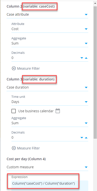
Here is an example to calculate case costs per case duration (e.g., euros per day) for each customer group (see the chart settings on the right). First, create a measure case cost and assign a variable caseCost in the Measures settings (Advanced tab). Create another measure case duration and assign a variable duration to it. Finally, create a custom measure with expression:
Column("caseCost") / Column("duration")
When using variable, the calculation logic is as follows: the measures defined as variable are aggregated first for each dimension value (i.e., each row in the table) before the custom expression is calculated for each dimension. See an example of the resulting table below:
Combined measures and columns
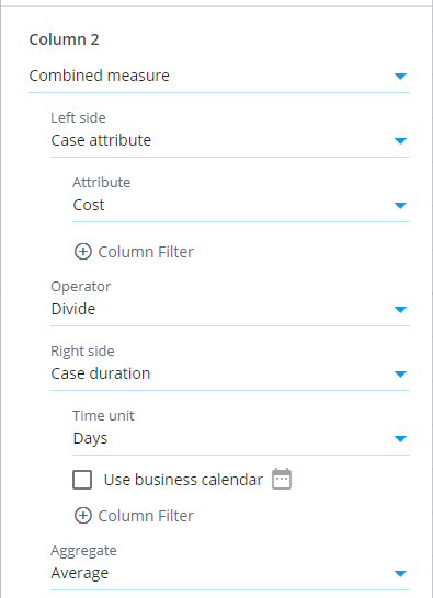
There is also the Combined measure and Combined column selections available which works differently than the chart variables: If the above example is implemented using the combined measure, the division is calculated individually for each case, and the division results are aggregated into the final measure value. The aggregation method is the one defined for the combined measure. See the chart settings dialog below, how to configure the combined measure.
The difference between the methods in this example is whether the aggregation or division is calculated first. See an example of the resulting table using the combined measure (data is same as for in the above example):
Using variables in dimensions
Variables can be used in dimensions by defining a variable to a measure and referring to that variable in the dimension. You need to set the measure aggregation to None to be able to use it the in a dimension. This is because the measures cannot be at the same time an aggregated measure and being used in as dimension. Note that it's not possible to define dimensions as variables, but the variables are defined in the measures section (both have the same options available, though).
Analyzed objects
When creating a chart, the starting point in selecting the data is the Analyzed objects selection. It determines what kind of objects are dimensioned (when dimensioning is used) or what kind of object are listed in results (when dimensioning is not used). There are different measure/dimension/column selections available depending on the Analyzed objects selection. In most charts, cases or events is the usual starting point but in some analyses also other Analyzed objects selections are used. The table below summarizes all available Analyzed objects selections.
| Analyzed objects | Description |
|---|---|
| Cases | Each individual case in the filtered eventlog. |
| Events | Each individual event in the filtered eventlog. |
| Event types | Each individual event type in the filtered eventlog. |
| Variations | Each individual variation in the filtered eventlog. |
| Flows | Each individual flow in the filtered eventlog. There is a parameter Show to select only certain flows with options: All flows, No start and end flows, No start flow, No end flows, No repeating flows, Only start and end flows, Only start flows, Only end flows, and Only repeating flows. Start flow is a flow that doesn't have a starting event and the ending event is the first event of the case. End flow is a flow that doesn't have a ending event and the starting event is the last event of a case. Start and end flows don't have a duration. Repeating flow is a flow where the start and end event are of the same type. |
| Specific flow | Gives a single flow. There are parameters Start and End to select the flow start and end event types. |
| Flow occurrences | Each individual flow occurrence in the filtered eventlog. There is a parameter Show working similarly as in the Flows analyzed objects. |
| Specific flow occurrences | Gives all flow occurrences of a single flow. There are parameters Start and End to select the flow start and end event types. |
| Datatable | Each individual row in the selected datatable. The datatable can be selected from a list of all datatables in the system. |
| Cases datatable | Cases datatable of the currently selected model. |
| Events datatable | Events datatable of the currently selected model. |
| Root causes | This analyzed objects is used by the Root causes analysis and it gives one row for each root cause finding. See the Root causes presets to see examples. |
| Clustering cases | Performs the clustering analysis followed by root causes analysis. See the Clustering analysis preset for how to use this selection. |
| Nonconformant event types | Each nonconformant event type in the filtered eventlog. The conformance analysis is run using the selected BPMN model (or BPMN model in the designModel variable). |
| Task log | Gives one row for each log entry in the Task log, fulfilling the criteria of the following settings:
|
| Running tasks at specific time | Gives one row for each log entry in the Task log, fulfilling the criteria of the following settings:
|
| Custom objects | Expression giving the analyzed objects expression can be defined by the user. |
Functionality comparison to in-memory chart
Visualization settings are the same between the Big Data Chart and in-memory chart. The data selection settings, measures and dimensions work differently. Differences are as follows:
- There are different set of analyzed objects, measures and dimensions available.
- Filtering cases and events can be done for each measure and dimension separately. This allows to build most KPI's flexibly without using custom expressions.
- Measures and dimensions have equal lists of available items. The difference is that an aggregation selection needs to be done for measures. Enabled by this, measures can be moved to dimensions and vice versa by clicking the Move to dimensions and Move to measures buttons.
- Custom expressions are written as SQL expressions which differs from the eventlog objects available in the in-memory charts. Note also that measure expressions in Big Data Chart don't include the aggregation logic, and thus the custom measure and dimension expressions are equal.
- Big Data Chart supports filtering similar to the in-memory chart, i.e., visualizations can be clicked to create filters for the selected items to drill down into them. However, Big Data Chart supports different kinds of expression based filter rules and thus expression based filter rules created in the Big data chart cannot be applied to the in-memory chart and vice versa.
- Event attribute used as the event type can be set for each Big Data chart separately, to visualize the process flow from different angles. For more information, see chart settings.
- The Any datatype is not supported by the Big Data Chart in case and event attributes. Thus, when importing data, specific datatypes need to be set for each column, for case and event attributes to be available.
- Following measure/dimension settings are not available: Calculate measure for, Custom aggregation expression, and Adjustment expression.
- Big data chart cannot be used with models using ODBC or expression datasources.
Calculation results are mostly the same between the Big Data Chart and in-memory chart, but there is one exception: If there are cases with events having exactly the same timestamp, in the Big Data Chart the order of events is the alphabetical order of event type names. In the in-memory chart, the order is based on the loaded data in the events datatable. The order of events affects for example the variations and flows the cases are belonging to.


