Filter Selectors
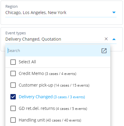
Filter selectors are an easy way to add and change filter rules in a dashboard. If certain filters are commonly changed when using a dashboard, it's recommended to add a filter selector to the dashboard for that type of filter. There are filter selectors available for case attribute values and event filtering by event types. Before a filter selector can be used with an object-centric model, the base object type needs to be selected.
When values are selected in the dropdown list, a corresponding filter rule is created and it's visible in the dashboard header. The list and the filter rule are kept in synchronization, i.e., when the list is changed, the filter rule is updated, and when the filter rule is changed in the dashboard header, the list updates accordingly.
Case attribute filter
The Case attribute filter allows to easily create case filters based on the case attribute distinct values. Case attribute filter selector has the following settings:
- Case attribute: Select the case attribute the dropdown list is bound to.
- Title: Defines a custom title for the dropdown list, if the case attribute name as the default title is not sufficient.
- Link to Dashboard filter: When unchecked, selecting values from the list creates a filter rule that is visible in the dashboard header. When checked, selecting values from the list creates a hidden filter rule that is not shown in the dashboard header. In the former case, the filter rule is applied to the Filter variable, and in the latter case it's applied to the DashboardFilter variable.
- Chart filter: Optional filter rules applied to the shown values in the list. This filter can be used to limit which values are available in the list and how the shown case counts are calculated.
- Maximum rows: Maximum number of rows shown by the list. If there are more values available than this limit, clicking the list opens a search dialog instead which can be used to search any of the available values (even if there are millions of values). Usually, when there are small number of values to choose from, the dropdown list is the easiest to use. When there are lot of values, it's not practical to show them all in the dropdown list and thus the search dialog becomes useful.
- Layout settings
In addition, there are the layout settings available.
Event type filter
Event type filter selector is used to filter events by the event type names. There are the same settings available as in the Case attribute filter selector, (except the case attribute selection is not applicable). The type of filter created is the include event types (note that the include cases by occurring event types is a different type of filter rule).
Dimension filter selector
The dimension filter selector (or just filter selector) is a generic filtering component that can filter distinct values from any type of dimensions. The component shows filterable values as selectable boxes for applying include filter rules. Values having no cases (due to other filter rules in the dashboard) are shown as grey and cannot be selected. If the dashboard filter contains a corresponding filter rule with the Filter selector, the Filter selectors is synchronized with the filter rule as follows:
- Selecting or unselecting boxes updates the filter rule values.
- Changes to the filter rule update the selected boxes in the filter selector.
- If all boxes are unselected, the corresponding filter rule is removed.
The Filter selector has the following settings, divided into tabs:
General Tab
- Title: Defines a shown title for the Filter selector.
- Base object type: Base object type for the perspective of the created filter. Shown only when an object-centric model is selected.
- Filtered items: Similar to the dimension selection, determining what kind of filter rules this selector creates or modifies.
- 1. measure/2. measure/...: Zero-to-many measures shown for each filterable item. The measure values are shown each in a separate line below the filter value in the box.
- Maximum rows: Limits the number of items shown.
- Sorting: Defines how the items are sorted.
- Analyzed objects: Which objects the query is based on to get the items.
Layout Tab
- See Layout settings
Filter Tab
- Follow Dashboard Filters: Determines whether measure values are filtered by the dashboard filter rules. Affects also whether boxes are greyed.
- Default filtering: Whether the component is bound to filtering cases or events.
- Component Filter: If some filtered values need to be hidden, they can be additionally filtered by this setting.
Advanced Tab
- Chart settings (editable): Similar to the setting in charts.
- Description: Similar to the setting in charts.
- On-screen settings: Similar to the chart on-screen settings.
- Linked Settings: Similar to the chart linked settings.
- Linked settings disabled: Selection to disable the Linked Settings.
- Model: Similar to the chart linked settings.
- Object-centric perspective settings: Similar to the settings in charts. Shown only when an object-centric model is selected.
- Event type mapping: Similar to the setting in charts.
