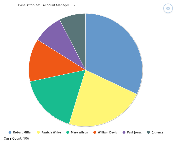
Profiling Event Analysis
Profiling Event Analysis shows how many events in the data have a particular event attribute value, i.e. distribution between different attribute values among the events. To run the Profiling analysis, right click the analysis background and select from the popup menu Profiling Event Analysis. For Profiling Analysis to be used, the model must have at least one event attribute. Profiling Analysis is available both in the Control and Analysis Windows.
Shown Information
The Profiling Event Analysis only has pie chart presentation available. You can click values in the pie chart or its legend in order to select the cases for that attribute value, and create a filter for those cases. Also multiple slices can be selected while keeping the Ctrl button pressed. For Profiling Event Analysis, those cases are selected that contain events having the selected event attribute values.
The table in the Profiling Event Analysis shows the following columns:
- Attribute value: Attribute value that the row represents.
- Cases #: Count of cases/events having that attribute value.
- Cases %: Percentage of cases/events having that attribute value.
In the table, you can click rows to select cases for that attribute value. Also multiple rows can be selected while keeping the Ctrl or Shift button pressed.
The profiled attribute can be selected in the Event attribute drop-down list in the top of the analysis. The list contains event attributes. Note that event attributes might have been filtered out in the active filter, and then they are not available in the list.
The total number of analyzed cases is shown in the bottom left in the analysis.
Analysis Settings
Clicking the Settings button on the Profiling Analysis will open the side pane for defining the Profiling Analysis Settings:
- Show as: Select Table to show the Profiling Analysis as a table, or Pie chart to show as a pie chart. This setting is available only in the Analysis Window.
- Show: Select All to show all values, or Limit To to define the number of most frequent attribute values to be shown. If there are more attribute values than the defined limit, the exceeding attribute values are grouped into the Others group when shown as pie chart.
