Snowflake Chart: Difference between revisions
| Line 3: | Line 3: | ||
== Using measure variables == | == Using measure variables == | ||
[[File:MeasureVariables.png|right|Using measure variables in Big Data chart]] | [[File:MeasureVariables.png|right|Using measure variables in Big Data chart]] | ||
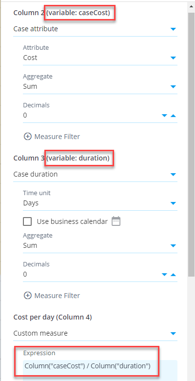
In Big Data chart, you can define that a measure is available as a '''variable''' and use that variable in a custom measure. This allows to define measures in a more versatile way, calculating them with the help of other measures. Here is an example | In Big Data chart, you can define that a measure is available as a '''variable''' and use that variable in a custom measure. This allows to define measures in a more versatile way, calculating them with the help of other measures. Here is an example to calculate case costs per case duration unit (euros per day) for each custom group. First, create a measure case cost and assign a variable ''caseCost'' to it in the ''Measures settings'' (''Advanced'' tab) (see the chart settings on the right). Create another measure case duration and assign a variable ''duration'' to it. Finally, create a custom measure with expression:<pre>Column("caseCost") / Column("duration")</pre> | ||
In the custom measure using variables, the measures defined as variable are aggregated first for each dimension value (i.e., each row in the table) before the custom expression is calculated for each dimension. See an example of the resulting table below: | In the custom measure using variables, the measures defined as variable are aggregated first for each dimension value (i.e., each row in the table) before the custom expression is calculated for each dimension. See an example of the resulting table below: | ||
Revision as of 23:04, 2 March 2023
Big Data Chart is a chart visualization performing calculations in Snowflake, whereas the in-memory chart uses the QPR ProcessAnalyzer in-memory calculation engine. Snowflake-powered calculation will enable practically unlimited scaling when the amount of data and number of users increase. When creating dashboards, Big Data Chart needs to be chosen when using Snowflake models. Big Data Chart can be added to dashboard by selecting the second item from the tool palette (labelled Big Data Chart).
Using measure variables
In Big Data chart, you can define that a measure is available as a variable and use that variable in a custom measure. This allows to define measures in a more versatile way, calculating them with the help of other measures. Here is an example to calculate case costs per case duration unit (euros per day) for each custom group. First, create a measure case cost and assign a variable caseCost to it in the Measures settings (Advanced tab) (see the chart settings on the right). Create another measure case duration and assign a variable duration to it. Finally, create a custom measure with expression:
Column("caseCost") / Column("duration")
In the custom measure using variables, the measures defined as variable are aggregated first for each dimension value (i.e., each row in the table) before the custom expression is calculated for each dimension. See an example of the resulting table below:
Combined measures
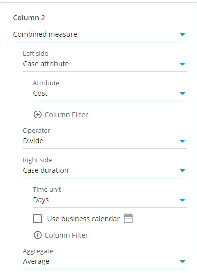
There is also the Combined measure selection available which works differently than the measure variables: If the above chapter's example is implemented using the combined measures, the division is calculated individually for each case, and the division results are aggregated into the final measure value. The aggregation method is the one defined for the combined measure. The difference between the methods is whether the aggregation or division is calculated first. See an example of the resulting table using the combined measure (data is same as for in the above charter's example):
Functionality differences to in-memory chart
Visualization settings are the same between the Big Data Chart and in-memory chart. The data selection settings, measures and dimensions work differently. Differences are as follows:
- There are different set of analyzed objects, measures and dimensions available.
- Filtering cases and events can be done for each measure and dimension separately. This allows to build most KPI's flexibly without using custom expressions.
- Measures and dimensions have equal lists of available items. The difference is that an aggregation selection needs to be done for measures. Enabled by this, measures can be moved to dimensions and vice versa by clicking the Move to dimensions and Move to measures buttons.
- Custom expressions are written as SQL expressions which differs from the eventlog objects available in the in-memory charts. Note also that measure expressions in Big Data Chart don't include the aggregation logic, and thus the custom measure and dimension expressions are equal.
- Big Data Chart supports filtering similar to the in-memory chart, i.e., visualizations can be clicked to create filters for the selected items to drill down into them. However, Big Data Chart supports different kinds of expression based filter rules and thus expression based filter rules created in the Big data chart cannot be applied to the in-memory chart and vice versa.
- Event attribute used as the event type can be set for each Big Data chart separately, to visualize the process flow from different angles. For more information, see chart settings.
- The Any datatype is not supported by the Big Data Chart in case and event attributes. Thus, when importing data, specific datatypes need to be set for each column, for case and event attributes to be available.
- Following measure/dimension settings are not available: Calculate measure for, Custom aggregation expression, and Adjustment expression.
- Big data chart cannot be used with models using ODBC or expression datasources.
Calculation results are mostly the same between the Big Data Chart and in-memory chart, but there is one exception: If there are cases with events having exactly the same timestamp, in the Big Data Chart the order of events is the alphabetical order of event type names. In the in-memory chart, the order is based on the loaded data in the events datatable. The order of events affects for example the variations and flows the cases are belonging to.
Big Data Chart for SQL Server processing
For special use cases, Big Data Chart can also be used for models with local datatables, performing processing in SQL Server. The benefits are that the model doesn't need to be loaded into memory, consuming less memory in the application server. Also no time need to be spent for the model loading. The disadvantage is that SQL Server is not optimal for analytical queries, meaning in practice insufficient performance in large dataset. Despite the limitation, there are use cases when Big Data Chart is a suitable for models with local datatables:
- Eventlogs are filtered heavily so that the number of remaining cases and events are low (usually maximum of some thousands), maintaining the performance in sufficient level.
- If the model is currently not available in the memory, it's faster to use Big Data Chart comparing to the in-memory chart, when the required time to load the model into memory is taken into account.


