Root Causes: Difference between revisions
m (Ollvihe moved page Root Causes for Case Attributes to Root Causes without leaving a redirect) |
|||
| (10 intermediate revisions by 2 users not shown) | |||
| Line 1: | Line 1: | ||
Root Causes shows correlations between cases selected in the Control Window and case attribute values in the model. For example, you might select cases that contain certain undesired event (in the flowchart) and analyze using the Root Causes, which case attributes and their value have a connection to this undesired behavior. There might be causalities behind the correlations, which would then help to find ''root causes'' for the occurrence of the observed phenomenon. | |||
In the | In the Root Causes one row represents cases with one case attribute value. The right-most colored column shows the correlation level between the selected cases and the case attribute value that the row represents. | ||
[[File:Influence_Analysis_for_Case_Attributes.png]] | [[File:Influence_Analysis_for_Case_Attributes.png]] | ||
== All Cases Have Equal Weight Mode == | == All Cases Have Equal Weight Mode == | ||
When the | When the Root Causes doesn't operate in the ''Weighted by Case Value'' mode, each case has equal weight in the analysis. | ||
When ''Show Detail Columns''' in not activated, the following columns are shown: | When ''Show Detail Columns''' in not activated, the following columns are shown: | ||
| Line 29: | Line 22: | ||
== Weighted by Case Value Mode == | == Weighted by Case Value Mode == | ||
When the | When the Root Causes works in the ''Weighted by Case Value'' mode, the weight of each case comes from the case attribute ''Cost''. Then more important cases have greater weight in the analysis. Note that event attribute ''Cost'' is not taken into account by this analysis. | ||
When ''Show Detail Columns | When ''Show Detail Columns'' in not activated, the following columns are shown: | ||
*'''Case Attribute''': Case attribute that the row represents. | *'''Case Attribute''': Case attribute that the row represents. | ||
*'''Attribute Value''': Case attribute value that the row represents. | *'''Attribute Value''': Case attribute value that the row represents. | ||
| Line 46: | Line 39: | ||
You can sort the columns in the analysis by clicking on the column headers. To filter the shown content of the table, click on the filter icon. | You can sort the columns in the analysis by clicking on the column headers. To filter the shown content of the table, click on the filter icon. | ||
== | == Root causes in flowchart == | ||
Root causes can be visualized in the flowchart showing how the event and flow occurrences correlate with the selected feature. Root causes analysis in the flowchart can be opened either by clicking the '''Root causes''' tab (if tabs on top of the flowchart are visible) or opening the flowchart settings and in the '''Presets''' tab, selecting '''Root causes''' (if tabs on top of the flowchart are not visible). Then choose a feature to find root causes for using either of the following methods: | |||
* Make a selection in a chart and and click the '''Show root causes''' button. | |||
* | * Click the red plus button in the header and choose the rule in the opening dialog. | ||
* ''' | |||
In the flowchart, correlations are visualized with colors for the event types and flows as follows: | |||
* The stronger the red color, the higher the '''positive correlation''' between the selected feature and the event type or flow occurrence. | |||
* The stronger the blue color, the higher the '''negative correlation''' between the selected feature and the event type or flow occurrence. | |||
* If there is no correlation or the correlation is weak, the color is grayish. | |||
Example | |||
Let's say we select cases with exceptionally long duration as a feature to find root causes for the long durations. In the following picture we can see that the event type ''Shopping Cart Created'' has occurred in 78% of the long cases, where as on average among all cases, ''Shopping Cart Created'' has occurred in 47% of cases. We may say that the occurrence of the ''Shopping Cart Created'' events may explain why some cases take longer. | |||
On the other hand, we can see that the event type ''PR Created'' has occurred in 14% of the long cases, where as on average among all cases, ''PR Created'' has occurred in 35% of cases. We may say that the occurrence of the ''Shopping Cart Created'' may contribute to completing some cases in shorter time. | |||
Same logic applies for the flows: for example the flow between ''Shopping Cart Approved'' and ''PO Item Created'' occurred in 78% of the long cases, where as on average among all cases, the flow has occurred in 46% of cases. We may say that this flow (i.e., the fact that ''PO Item Created'' occurs directly after ''Shopping Cart Approved'') may explain why some cases take longer. | |||
[[File:Root causes flowchart.png]] | |||
[[Category: QPR ProcessAnalyzer]] | |||
Latest revision as of 15:02, 1 May 2023
Root Causes shows correlations between cases selected in the Control Window and case attribute values in the model. For example, you might select cases that contain certain undesired event (in the flowchart) and analyze using the Root Causes, which case attributes and their value have a connection to this undesired behavior. There might be causalities behind the correlations, which would then help to find root causes for the occurrence of the observed phenomenon.
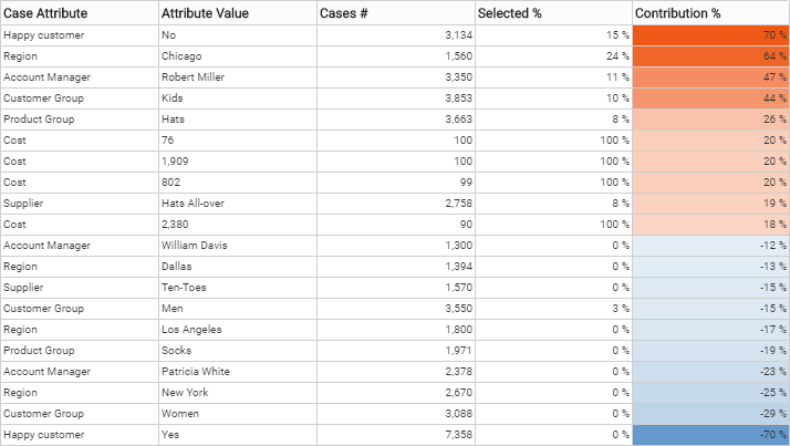
In the Root Causes one row represents cases with one case attribute value. The right-most colored column shows the correlation level between the selected cases and the case attribute value that the row represents.
All Cases Have Equal Weight Mode
When the Root Causes doesn't operate in the Weighted by Case Value mode, each case has equal weight in the analysis.
When Show Detail Columns' in not activated, the following columns are shown:
- Case Attribute: Case attribute that the row represents.
- Attribute Value: Case attribute value that the row represents.
- Cases #: Number of cases having the case attribute value that the row represents.
- Selected %: Shows how many percentage of the cases with that case attribute value are in the selected set of cases. Calculation rule: [Selected #] / [Cases #] * 100.
- Contribution %: Percent of the selected cases with the attribute value that contributes to the "Difference %".
When Show Detail Columns is activated, the following additional columns are shown:
- Selected #: Number of cases in the selected group that have the case attribute value that the row represents.
- Compared #: Number or cases in the unselected group that have the case attribute value that the row represents. Calculation rule: [Cases #] - [Selected #].
- Difference %: Deviation in percentage between Selected % and the average percentage of selected cases among all analyzed cases.
- Contribution #: the number of cases which contribute to the "Difference %", i.e. the deviation from the average percentage. Shown when "Show Detail Columns" is selected in the analysis settings, but not when "Weighted by Case Value" is selected in the analysis settings.
Weighted by Case Value Mode
When the Root Causes works in the Weighted by Case Value mode, the weight of each case comes from the case attribute Cost. Then more important cases have greater weight in the analysis. Note that event attribute Cost is not taken into account by this analysis.
When Show Detail Columns in not activated, the following columns are shown:
- Case Attribute: Case attribute that the row represents.
- Attribute Value: Case attribute value that the row represents.
- Cases Value: Sum of case costs of the cases having the case attribute value that the row represents.
- Selected %: Percentage of the selected cases costs out of the all cases costs among the case attribute value that the row represents. Calculation rule: [Selected Value] / [Cases Value] * 100.
- Contribution %: Percent of the cost of cases which contribute to the Difference %.
When Show Detail Columns is activated, the following additional columns are shown:
- Selected Value: Sum of case costs among the selected cases that have the case attribute value that the row represents.
- Compared Value: Sum of case costs among the unselected cases that have the case attribute value that the row represents. Calculation rule: [Cases Value] - [Selected Value].
- Difference %: Shows how much more the Selected % is comparing to the average percentage of selected cases out of all cases.
- Contribution Value: Total cost of cases which contribute to the Difference %.
You can sort the columns in the analysis by clicking on the column headers. To filter the shown content of the table, click on the filter icon.
Root causes in flowchart
Root causes can be visualized in the flowchart showing how the event and flow occurrences correlate with the selected feature. Root causes analysis in the flowchart can be opened either by clicking the Root causes tab (if tabs on top of the flowchart are visible) or opening the flowchart settings and in the Presets tab, selecting Root causes (if tabs on top of the flowchart are not visible). Then choose a feature to find root causes for using either of the following methods:
- Make a selection in a chart and and click the Show root causes button.
- Click the red plus button in the header and choose the rule in the opening dialog.
In the flowchart, correlations are visualized with colors for the event types and flows as follows:
- The stronger the red color, the higher the positive correlation between the selected feature and the event type or flow occurrence.
- The stronger the blue color, the higher the negative correlation between the selected feature and the event type or flow occurrence.
- If there is no correlation or the correlation is weak, the color is grayish.
Example
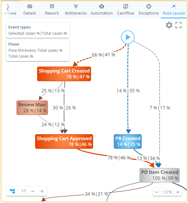
Let's say we select cases with exceptionally long duration as a feature to find root causes for the long durations. In the following picture we can see that the event type Shopping Cart Created has occurred in 78% of the long cases, where as on average among all cases, Shopping Cart Created has occurred in 47% of cases. We may say that the occurrence of the Shopping Cart Created events may explain why some cases take longer.
On the other hand, we can see that the event type PR Created has occurred in 14% of the long cases, where as on average among all cases, PR Created has occurred in 35% of cases. We may say that the occurrence of the Shopping Cart Created may contribute to completing some cases in shorter time.
Same logic applies for the flows: for example the flow between Shopping Cart Approved and PO Item Created occurred in 78% of the long cases, where as on average among all cases, the flow has occurred in 46% of cases. We may say that this flow (i.e., the fact that PO Item Created occurs directly after Shopping Cart Approved) may explain why some cases take longer.

