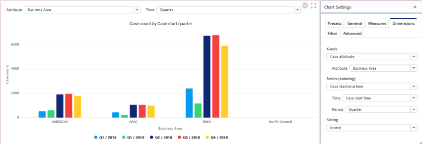
Chart On-screen Settings
Parameters of measures, dimensions, columns and analyzed objects can be defined as on-screen settings, bringing the settings easily available in the dashboard (above the chart). When the commonly used settings are defined as the on-screen settings, the settings dialog doesn't need to be opened at all.
Configuration
On-screen settings are defined as a JSON array, where each item has the following properties:
- type: Either measure, dimension, eventtypemeasure (for Event measures in flowchart), flowmeasure (for Flow measures in flowchart) or root. If slicing into dimensions is disabled, columns correspond to dimensions.
- index (integer): Index of the expression. Not used for the root.
- parameter (string): Name of the parameter.
- label (string): Custom label for the field.
- maxWidth (integer): Maximum width of the shown setting in pixels.
- newLine (boolean): Defines whether the setting is positioned to a new line for more spacing between settings.
- excludeCaseIdColumn (boolean): When showing case or event attribute, this setting will hide the case id column from the list. Use value true to hide the case id.
- includeChartFilters (boolean): When showin a dropdown list with model data, this setting determines whether the list content is filtered with the chart filter rules.
- includeOnly (string array): With this setting, it's possible to filter the shown dropdown list values by explicitly listing the shown values.
- allowedDatatypes (string array): With this setting, it's possible to filter the shown case and event attributes in the dropdown list by explicitly listing the attribute datatypes which are shown. Allowed values: String, Integer, Float, DateTime, Boolean.
When using custom expressions, it's possible to define parameters for them as on-screen settings. To do that, there are additional properties to be set that define which kind of UI control is used. The following parameters can be used:
- control (string): UI control type which is one of the following: singleselectlist, dynamicsingleselectlist, multiselectlist, singlelinetext, multilinetext, numericfield, datefield, datetimefield, checkbox, colorpicker, bpmneditor.
- minValue (number): For numericfield, specified the minimum allowed numerical value.
- decimals (integer): For numericfield, specified whether decimal numbers can be specified (or only integer numbers). Note: Up to QPR ProcessAnalyzer 2021.9 this settings is allowDecimals (true/false).
- mandatory (boolean): Defined that the UI control is mandatory, i.e. the chart is not drawn until a value has been specified.
- unit (string): For numericfield, show unit for the numerical value.
- updateImmediately (boolean): For singlelinetext and multiselectlist, specified whether the chart is updated with each change of the input box value. When disabled, the value updated only when cursor leaves the input box.
- options: Fixed options for the singleselectlist. Array of object with following properties: label (user visible text in the dropdown list) and identifier (actual stored value to the parameter).
- optionsData (string): When control is singleselectlist, defines type of items shown by the dropdown list. One of the following: AggregateNumbers, AggregateDates, AggregateDurations, AggregateDurationsWithoutNulls, AggregateText, SqlAggregateNumbers, SqlAggregateDates, SqlAggregateText, TimeUnits, DurationUnits, Periods, CountOrPercentage, CountOrPercentageCases, CountOrPercentageEvents, NumericalComparison, EventIndex, FlowStartEndEvent, DataTypes.
- dynamicType (string): When control is dynamicsingleselectlist or multiselectlist, defines type of items shown by the dropdown list. One of the following: CaseAttributes, CaseAttributeValues, EventAttributeValues, EventAttributes, EventTypes, Variations, FlowsStartingFrom, StartEventTypes, EndEventTypes, CaseIds, DataTables, DataTableColumns, DataTableColumnsByDatatableName, AnalysisColumns, DataTablesOfProject, Models, ModelById, Projects, Scripts
It's also possible to change UI controls for the standard expressions, by overriding UI control settings in the on-screen settings. All above mentioned parameters can be used, except the the UI control type cannot be changed (i.e. the control parameter cannot be used).
Examples
[
  {
    "type": "dimension",
    "index": 0,
    "parameter": "Attribute",
    "maxWidth": 500
  },
  {
    "type": "dimension",
    "index": 1,
    "parameter": "Period",
    "label": "Time"
  }
]
Creates a custom numeric field, where minimum value is 1 on decimals are allowed:
[
  {
    "type": "measure",
    "index": 0,
    "parameter": "var1",
    "maxWidth": 200,
    "control": "numericfield",
    "decimals": 2,
    "minValue": 1
  }
]
This example creates a custom dropdown list with predefined options:
[
  {
    "type": "measure",
    "index": 0,
    "parameter": "var1",
    "maxWidth": 200,
    "label": "Select option",
    "control": "singleselectlist",
    "options": [
     {
       "label": "Option 1",
       "identifier": "option1"
     },
     {
       "label": "Option 2",
       "identifier": "option2"
     },
     {
       "label": "Option 3",
       "identifier": "option3"
      }
    ]
  }
]
