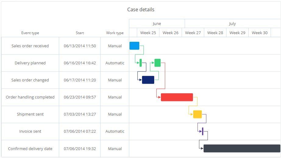
Gantt Chart
Gantt chart is mostly used for illustrating project schedule and breakdown into tasks, but in process mining gantt chart can also be used to visualize events in an individual case, or how events in multiple cases interact or coincide with each other. The gantt chart has the horizontal calendar time axis and vertically it shows swimlanes.
Gantt chart features
Gantt chart has the following features:
- There is a milestone diamond for items with zero duration (i.e., start time is same as end time, or the end time is not defined).
- Gantt chart is able to visualize the dependencies between items by drawing arrows between them. This requires the unique id and the predecessor item id to be defined.
- Gantt chart is able to show the swimlanes in a hierarchy. This requires the unique id and the parent id to be defined.
- Additional properties for the swimlane items can be shown in the table left side of the gantt chart. There can be as many columns as needed.
- Completion percentage for each item can be shown. Left side of the item is darker showing a bar inside the item.
- Filters can be created in the gantt chart by clicking one or several items.
- Gantt chart can be zoomed using the lasso tool (move the mouse in the gantt chart while keeping the left mouse button pressed).
- The vertical line as the current point of time indicator is shown (assuming time data for future is provided to the chart).
Gantt chart mappings
The features in the gantt chart are activated by using available mappings. The mapping settings can be found in the measure, dimension or column settings dialog. Gantt chart has the following mappings:
- Swimlane name: Swimlane where the item belongs to. Swimlane names are unique, so if there are several items with the same name, they go to the same swimlane. The swimlane mapping is mandatory.
- Start time: Start time of the item. The start time mapping is mandatory.
- End time: End time of the item. If the end time is not defined or contains a null value, the item is shown as the milestone diamond.
- Table column: Data mapped as Table column is shown as a table left side of the gantt chart. There can be several table column mappings, each appearing as separate columns.
- Completion percentage: Gantt chart can to show the completion percentage for each item. The completion percentage needs to be provided as a percentage value between 0 and 100. This mapping is optional.
- Item id: Technical id for the items, defining the item id for parents and predecessors. If this mapping is not defined, the Swimlane name mapping is used as the item id.
- Parent id: Defines the parent for each item. Refers to the Item id (if defined) or Swimlane name of the parent. When this mapping is defined, the swimlanes are shown in a hierachy.
- Predecessor id: Defines the predecessor (dependency) for an item. Refers to the Item id (if defined) or Swimlane name of the predecessor item. The predecessors are shown as arrows.
- Show in tooltip: Data is shown in the tooltip which is the box appearing when an item is hovered with the mouse. Multiple of these type of mappings can be provided.
- Show in datalabel: Data is shown over the item in the gantt chart. Multiple of these type of mappings can be provided.
- Color: Defines that items are colored based on this data, so each item with the same value will get the same color. Note that this mapping is not for directly providing the color code, but the colors are coming from the color palette.
Colors and conditional formatting
Items in the gantt chart get colors from the color palette (available in the chart settings), when neither the Color mapping nor the conditional formatting are defined. The Color mapping is an easy way to show which items have the same value for the mapped data. The most advanced method to define colors is to use the conditional formatting which has different logics available to define the colors, such as traffic lights or color scales.
The conditional formatting json needs to be defined to the measure/dimension/column that is mapped to the swimlane name.
Example: Traffic lights colors based on a numerical values:
{
  "color": {
    "value": {
      "type": "dimension",
      "index": 3
    },
    "rules": [
      {
        "color": "#FF0000",
        "value": 20,
        "comparison": "<"
      },
      {
        "color": "#00FF00"
      }
    ]
  }
}
Example: Color scale based on a numerical values defined in the 4th column:
{
  "color": {
    "value": {
      "type": "dimension",
      "index": 3
    },
    "scale": [
      {
        "value": 0,
        "color": "#FFFFFF"
      },
      {
        "value": {
          "type": "dimension",
          "index": 3,
          "aggregate": "max"
        },
        "color": "#FFD851"
      }
    ]
  }
}
Example: Color hexadecimal code coming from the 4th column (using some kind of custom expression):
{
	"color": {
		"color": {
		  "type":"dimension",
		  "index": 3
		}
	}
}
