QPR ProcessAnalyzer Table
Table is a basic but versatile visualization for a flat dataset which is the data structure provided by the calculation.
Table functionalities
Table has the following functionalities:
- Table shows rows in queried data as the table rows and dimensions/measures/columns as the table columns (in the order as they are defined and dimensions left of measures).
- If there are dimensions/columns where corresponding filters can be created, clicking rows/cells creates the filter.
- When there is maximum of one dimension/column defined, the table has row selection mode in use. When there are more than one dimension/column, cell selection mode is in use.
- By default, there is the multi-selection in use (i.e. clicking keeps the previous selections). Single-selection can be applied with Ctrl key pressed. Range selection within a column can be used with Shift key.
- Table rows can be sorted ascending or descending by columns. Multi-column sorting works with Ctrl key pressed.
- Table columns can be reordered by dragging them from the header.
- Table columns can be resized from the handle right side of the column header. The new widths are stored permanently to chart settings when the dashboard is saved.
- Table can be filtered using the Excel-style column filtering, which is converted into model filter when the selection is confirmed. There are different filtering options available depending on the column type, e.g. for textual columns there are equals, not equals, starts with, ends with, contains and not contains filters, and for numerical columns there are equals, not equals, less than (or equals) and greater than (or equals) filters. In addition, greater and less than filters can be combined to have between filtering.
- The table has an optional title above the table.
- Table can be exported as Excel file and CSV file. Precise values of numbers and dates will go to the Excel file.
- If there are more than 200 rows in the table, paging is enabled and footer for controlling paging is visible. The footer also has an option to change the number of rows per page.
- Table supports the Custom Layout settings (options supported by Syncfusion) overriding the default settings set by the chart.
- Columns can be hidden using the Hidden checkbox in the measure/dimension/column settings.
- Text in a table cell can be set to be a web link to an external site (that opens to a new tab). The text will be the clickable link and clicking outside the text still makes model filter like without the web link.
Table actions
Clicking texts in the table can open web links and set dashboard variables. These are configured using the table actions as follows:
- Open web link: Measure/dimension/column will be a clickable web link opening the defined web site. Only the text in the table cell is clickable, so filtering is possible when clicking next to the text. To refer to the data in the same row, web links can contain tags (e.g. ${dimension:1}), which are replaced with the data. You can also refer to the clicked value with ${this}. If the web link only consists of a single tag, the tag value is not encoded (because the tag is assumed to contain a full url). If the web link contains static text in addition to the tags, the tag values are encoded using encodeUriComponent (because tags are assumed to be used as url parameters). If the link does not start with http:// or https://, the link is interpreted as a relative link which is added to the end of the QPR ProcessAnalyzer address to form the complete link. Examples: https://google.com/search/q=${measure:2}, https://wiki.onqpr.com/pa/index.php?search=${this}, qprpa/ui/#/dashboard?sys:dashboard=123&myVariable=${dimension:1}
- Set dashboard variables: Set variables when clicking the text in the table cell. Similar tags as for the web link, can be used both for the variable name and variable value fields. If there is either the sys:dashboard or sys:dashboardIdentifier variable among the changed variables (i.e. clicking will go to other dashboard), the variables are set to the session level - otherwise they are set to the dashboard level. If defining the Filter or Comparison variable with an empty value, the corresponding filter or comparison rule is created automatically (works only for dimensions). Variable values are always strings because the value is defined as a string "template". For Snowflake models, variable values are formatted using the stringified format (they are compatible with the linked settings), and for in-memory models variable values are set as such without any formatting.
The checkbox Open in new window determines whether the target opens to the same browser window or to a new window or tab. When checked, the link will be opened or variables will be set in a new browser window or tab. When unchecked, the link will be opened or variables will be set in the same window.
It's also possible to run scripts that are available in the table context menu.
Conditional formatting
Table conditional formatting can be used to define table cell background colors, text colors, colored icons and databar, where all depend on the data in the table. Conditional formattings are defined in the measure/dimension/column settings as JSON with following allowed properties:
- backgroundColor / textColor
- rules: Rules are checked in the defined order and the first matching rule determines the color.
- color: Color to use when the rule matches.
- value: Value to compare. Value can be numerical, textual, boolean or null.
- comparison: Type of the comparison which is one of the following: <, >, <=, >=, =, !=. Less than and greater than comparisons can only be used for numbers.
- scale
- color: Color for the scale boundary.
- value: Value for the scale boundary. Value needs to be numerical.
- color: Color that is used when there are no matching rules, or rules/scale is not defined.
- value: When defined, conditional formatting is based on this value. When not defined, the cell value is used by default.
- rules: Rules are checked in the defined order and the first matching rule determines the color.
- databar
- min: Value that represents the databar minimum position (i.e. when databar is not visible).
- max: Value that represents the databar maximum position (i.e. databar fills the whole cell).
- value: Value where the databar width is based on. When not defined, the databar width is based on the data in the same cell.
- color: Color of the databar. Can be defined in similar way as the backgroundColor. Default color is #4bc3ff.
- icon
- rules: Similar syntax can be used as in the backgroundColor rules, except instead of "color" there is "icon" attribute to define the icon. All Google Material Icons are available: https://material.io/resources/icons/.
- color: Color of the icon. Can be defined in similar way as the backgroundColor. Default color is #333333.
Defining numeric properties
All values in the conditional formatting can be defined as follows:
- fixed numerical value, e.g.,
"value": 5
- fixed textual value, e.g.,
"value": "Dallas"
- fixed boolean value, e.g.,
"value": true
- aggregate of the same column data, e.g.,
"value": {
  "aggregate": "max"
}
- refer to a cell value in other column in the same row, e.g.,
"value": {
  "type": "dimension",
  "index": 1
}
- aggregate of another column data, e.g.,
"value": {
  "type": "measure",
  "index": 2,
  "aggregate": "max"
}
Available aggregations are: min, max, sum, average, median, first, last.
Defining color and icon properties
All color and icon properties in conditional formatting can be defined as follows:
- fixed value, e.g.,
"value": "#AABBCC"
- refer to a cell value in other column in the same row, e.g.,
"value": {
  "type": "dimension",
  "index": 1
}
Conditional formatting examples
Below are listed the examples used in dashboards with their respective use cases and Conditional formatting expressions. The recommended colors and their color codes are as follows:
- Green: #68DD8F (Positively correlating KPIs)
- Red: #EF5254 (Negatively correlating KPIs)
- Blue: #4BC3FF (Case/Event counts)
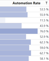
- Dark blue: #0F55A5 (Automation)
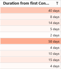
- Orange: #FEA88A (Durations)
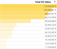
- Yellow: #FFD851 (Value/Cost)
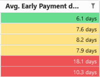
Traffic lights
Use case: KPIs based on traffic light signaling
{
  "backgroundColor": {
    "rules": [
      {
        "color": "#EF5254",
        "value": 10,
        "comparison": ">="
      },
      {
        "color": "#FFD851",
        "value": 6.5,
        "comparison": ">="
      },
      {
        "color": "#68DD8F"
      }
    ]
  }
}
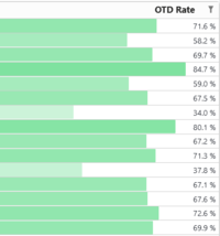
Green databar
Use case: KPIs where 100% is a desired value, eg. On-Time Delivery
{
	"databar": {
		"min": 0,
		"max": 100,
		"color": {
			"scale": [
				{
					"value": 0,
					"color": "#FFFFFF"
				},
				{
					"value": { "aggregate": "max" },
					"color": "#68DD8F"
				}
			]
		}
	}
}
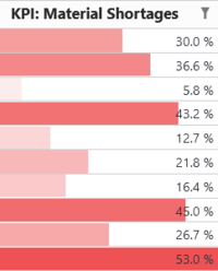
Red databar
Use case: KPIs where 0% is the desired value and you want to highlight the worst performers of this metric, eg. Material shortages
{
	"databar": {
		"min": 0,
		"max": { "aggregate": "max" },
		"color": {
			"scale": [
				{
					"value": 0,
					"color": "#FFFFFF"
				},
				{
					"value": { "aggregate": "max" },
					"color": "#EF5254"
				}
			]
		}
	}
}
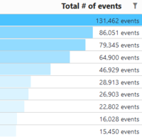
Blue databar
Use cases: Case/event counts
{
	"databar": {
		"min": 0,
		"max": { "aggregate": "max" },
		"color": {
			"scale": [
				{
					"value": 0,
					"color": "#FFFFFF"
				},
				{
					"value": { "aggregate": "max" },
					"color": "#4BC3FF"
				}
			]
		}
	}
}
Dark blue databar
Use case: Automation rate and similar metrics that scale 0-100%
{
	"databar": {
		"min": 0,
		"max": 100,
		"color": {
			"scale": [
				{
					"value": 0,
					"color": "#FFFFFF"
				},
				{
					"value": { "aggregate": "max" },
					"color": "#7588C4"
				}
			]
		}
	}
}
Yellow databar
Usecase: Monetary KPIs such as cost/value
{
	"databar": {
		"min": 0,
		"max": { "aggregate": "max" },
		"color": {
			"scale": [
				{
					"value": 0,
					"color": "#FFFFFF"
				},
				{
					"value": { "aggregate": "max" },
					"color": "#FFD851"
				}
			]
		}
	}
}
Orange scale
Use case: Durations
{
  "backgroundColor": {
    "scale": [
      {
        "value": {"aggregate": "max" },
        "color": "#fea88a"
      },
      {
        "value": {"aggregate": "min" },
        "color": "#FBE8E6"
      }
    ]
  }
}
Icons in table cells
Adds an icon left of the value (icon sentiment_satisfied_alt if value is over 100 and otherwise sentiment_very_dissatisfied). Also icons have different colors.
{
	"icon": {
		"rules": [
			{
				"icon": "sentiment_satisfied_alt",
				"value": 100,
				"comparison": ">"
			},
			{
				"icon": "sentiment_very_dissatisfied"
			}
		],
		"color": {
			"rules": [
				{
					"color": "#68DD8F",
					"value": 100,
					"comparison": ">"
				},
				{
					"color": "#EF5254"
				}
			]
		}
	}
}
Textual equal rules for background color
If cell content is "Dallas", background color is #00FF00. If cell content is "New York", background color is #FF0000. Other cells have background color #FFFF00.
{
   "backgroundColor":{
      "rules":[
         {
            "color":"#00FF00",
            "value":"Dallas",
            "comparison":"="
         },
         {
            "color":"#FF0000",
            "value":"New York",
            "comparison":"="
         },
         {
            "color":"#FFFF00"
         }
      ]
   }
}
Numerical not equal rules for background color
If cell content is not 5, background color is #00FF00. Other cells have background color #FFFF00.
{
   "backgroundColor":{
      "rules":[
         {
            "color":"#00FF00",
            "value":5,
            "comparison":"!="
         },
         {
            "color":"#FFFF00"
         }
      ]
   }
}
Boolean equal rules for background color
If cell content is "true", background color is #00FF00. If cell content is "false", background color is #FF0000. Other cells have background color #FFFF00.
{
   "backgroundColor":{
      "rules":[
         {
            "color":"#00FF00",
            "value":true,
            "comparison":"="
         },
         {
            "color":"#FF0000",
            "value":false,
            "comparison":"="
         },
         {
            "color":"#FFFF00"
         }
      ]
   }
}
Equal rules getting reference value from other column
If cell content in same as in dimension index 2, background color is #00FF00, if cell content in same as in dimension index 3, background color is #FF0000, and other cells have background color #FFFF00.
{
   "backgroundColor":{
      "rules":[
         {
            "color":"#00FF00",
            "value":{
               "type":"dimension",
               "index":2
            },
            "comparison":"="
         },
         {
            "color":"#FF0000",
            "value":{
               "type":"dimension",
               "index":3
            },
            "comparison":"="
         },
         {
            "color":"#FFFF00"
         }
      ]
   }
}
Textual equal rules based on value in other column
If cell content in dimension index 1 is "Delivery", background color is #00FF00. Other cells have background color #FFFF00. Note that this conditional formatting results in same colors in all columns because the conditional formatting is not referring to the column itself.
{
   "backgroundColor":{
      "value":{
         "type":"dimension",
         "index":1
      },
      "rules":[
         {
            "color":"#00FF00",
            "value":"Delivery",
            "comparison":"="
         },
         {
            "color":"#FFFF00"
         }
      ]
   }
}
Textual equal rules for icons with colors
If cell content is "Delivery", icon is "arrow_upward" with color is #FF0000. Other cells icon is "arrow_downward" with color is #00FF00.
{
   "icon":{
      "rules":[
         {
            "icon":"arrow_upward",
            "value":"Delivery",
            "comparison":"="
         },
         {
            "icon":"arrow_downward"
         }
      ],
      "color":{
         "rules":[
            {
               "color":"#FF0000",
               "value":"Delivery",
               "comparison":"="
            },
            {
               "color":"#00FF00"
            }
         ]
      }
   }
}
Other examples
Background color is based on a color scale where column minimum value zero gets color #FFFFFF and maximum value #FFD851. Color is scaled linearly between these colors.
{
	"backgroundColor": {
		"scale": [
			{
				"value":  0,
				"color": "#FFFFFF"
			},
			{
				"value": { "aggregate": "max" },
				"color": "#FFD851"
			}
		]
	}
}
Similar to previous example, except minimum and maximum values come from another column (measure number 1).
{
	"backgroundColor": {
		"scale": [
			{
				"value": { "type":"measure", "index": 1, "aggregate": "min" },
				"color": "#FFFFFF"
			},
			{
				"value": { "type":"measure", "index": 1, "aggregate": "max" },
				"color": "#FFD851"
			}
		]
	}
}
The following setting defines a fixed background color for a column.
{
	"backgroundColor": {
		"color": "#FFD851"
	}
}
Background color code is taken from column measure 1 from the same row.
{
	"backgroundColor": {
		"color": {
		  "type":"measure",
		  "index": 1
		}
	}
}
Text color is #FF0000 if value is lower than 20, otherwise #00FF00.
{
	"textColor": {
		"rules": [
			{
				"color": "#FF0000",
				"value": 20,
				"comparison": "<"
			},
			{
				"color": "#00FF00"
			}
		]
	}
}
Creates a red-white-green color scale where the minimum value is red, the nominal value (eg. a target value) of 50 is white and maximum value is green.
{
  "backgroundColor": {
    "scale": [
      {
        "value": { "aggregate": "min" },
        "color": "#EF5254"
      },
      {
        "value": 50,
        "color": "#FFFFFF"
      },
      {
        "value": { "aggregate": "max" },
        "color": "#68DD8F"
      }
    ]
  }
}
Background color uses a color scale where the colors are based on values in dimension index 2 (requires that the dimension contains numerical data). This conditional formatting can be applied to any column (also textual columns).
{
  "backgroundColor": {
    "value": {
      "type": "dimension",
      "index": 2
    },
    "scale": [
      {
        "value": 0,
        "color": "#FFFFFF"
      },
      {
        "value": {
          "type": "dimension",
          "index": 2,
          "aggregate": "max"
        },
        "color": "#FFD851"
      }
    ]
  }
}
