Sankey Chart
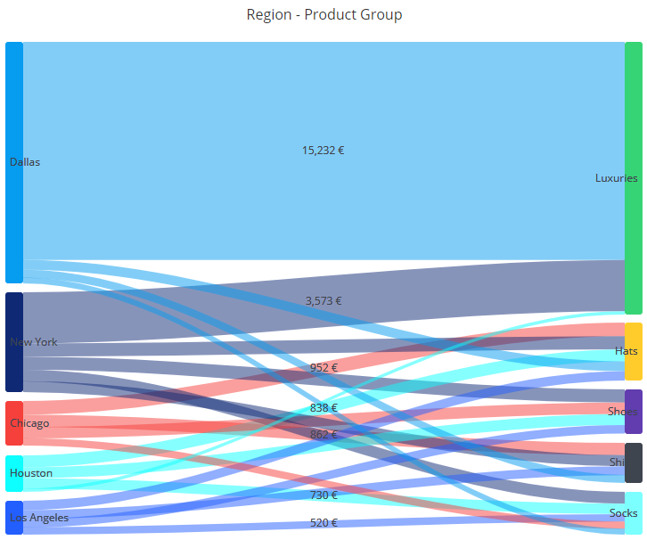
Sankey chart visualizes for examples volumes of related items between two or more set of features. It's also suitable for showing flow of material or information from place to other. In the sankey, there are two or more vertical pillars, containing the values of the features. There are flows drawn between the feature values where the width of the flow represents the weight of the feature combination.
To use the sankey, following mappings need to be defined:
- Start: The feature on the left side of the sankey. Usually it contains textual data, but any data type can be used.
- End: The feature on the right side of the sankey. Usually it contains textual data, but any data type can be used.
- Weight: The weight determines the widths of the flow drawn between the left and right value.
By default, the first dimension has the start mapping, the second dimension has the end mapping, and the first measure is mapped to the weight. If you need to change the mappings, they can be set in the measure, dimension or column settings dialog.
There can also be the following mappings:
- Start level: Defines which level the flow starts from. If not defined, all flows start from the left-most level. The left-most level is level 0.
- End level: Defines which level the flow ends to. If not defined, all flows end to the next level from the start.
when defining the start level, you can create sankey charts where there are more than two levels. When defining the end level, you can create sankey charts where flows jump over levels.
Sorting can be used to set the vertical order of start and end items in the left and right pillars of the sankey. If sorting by the dimension mapped as start or end, the order is set alphabetically by the start or end items. If sorting by the weight, the highest or lowest weight flows are on top.
Creating filters is also possible when clicking the flows in the sankey. The created filter is based on the dimensions or columns that are mapped as start and end. Note that creating filters is not always possible, as there needs to be a meaningful filter rule available that represents the dimension/column.
Sankey is also able to visualize backward flows (i.e., starting point is right side and the ending point on the left side), but sometimes the sankey may not be the best visualization for the purpose. If there are backward flows, you can use the dependency wheel or flowchart instead.
Here is an example of the sankey visualizing sales data by showing what regions sell what products and how remarkable are the sales volumes.
Use cases for sankey:
- Visualize how two different case or event attributes are linked together. The weight can be the case/event count or numerical case/event attribute, such as cost if it's available.
- Visualize transition between two event types in the process flow.
