QPR ProcessAnalyzer Chart: Difference between revisions
| Line 86: | Line 86: | ||
== Working with custom expressions == | == Working with custom expressions == | ||
In addition to the | In addition to the ready-made measures, dimensions and columns, you can write your own expression for a custom calculation logic. Custom expressions can be written by selecting the '''Custom expression''' item from the list (the last item) and defining the expression to the '''Expression''' field. In addition, data type of the expression needs to be defined in the '''Data type''' field. The data type must match with the actual data produced by the expression. | ||
In addition, there is the possibility to define | In addition, there is the possibility to define '''Additional root expression''' which is an expression that is calculated in the entire eventlog's context. The additional root expression can be used e.g. to define a variable to store the eventlog level calculations there, and thus the variable is available in the measure, dimension or column expression. | ||
An easy way to write custom expressions is to start | An easy way to write custom expressions is to start from the ready-made measures, dimensions and columns: find a suitable ready-made item and click the '''Convert to custom expression''' button to create a custom expression that is exactly the same as the ready-made measure, dimension or column. You can now edit the expression for your customized need. When writing expressions, it's important to note the context in which each expression is run. Dimensions and columns are run in the individual analyzed object context, and measures in a set of analyzed objects context. | ||
When writing expressions, it's | |||
== Layout Settings == | == Layout Settings == | ||
Revision as of 13:17, 15 September 2021
Chart allows to create versatile and visually appealing charts with flexible KPI definitions to answer many business needs. Chart allows to calculate KPI's from the process mining objects, such as cases, events, event types and flows. The data can be sliced into freely selectable dimensions and KPIs calculated for each dimension to visualize comparisons, benchmarks and trends. It's also possible to disable slicing to show a simple list of all analyzed items.
Introduction
Chart is available as the first item in the tool palette. In a basic form, the result of this analysis is a table with the following columns: (1) One column for each specified dimension, and (2) at least one column for each specified value. The result of this analysis is a table with one row for each unique dimension value combination.
The basic flow of using the chart is the following:
- Choose objects to visualize, e.g. cases, events, event types or variations.
- Choose how to slice (or dimension) the data into parts, e.g. by attributes (regions, products), by durations or by dates (months, quarters).
- Choose measures/KPI's to be calculated for each dimension. Measure could be e.g. number of items, average duration, or cost.
- Choose the best visualization for the data, such as column charts, donut charts or tables.
Chart also has a fullscreen mode which expands one chart to the entire screen. The fullscreen is available in the icon on top right corner of each chart. The fullscreen can be disabled, by clicking the cross icon in the top right. When in the fullscreen, filtering can be done and on-screen settings are disabled.
Chart is available in the navigation menu where there are ready-made views containing chart, such as Process Discovery. The ready-made views are for ad-hoc analysis, and the settings cannot be saved, but they are preserved during the user session. Chart is also available as a component when creating dashboards, where chart settings are saved as part of the dashboard, and thus all users see the dashboard as it was designed.
Visual Settings
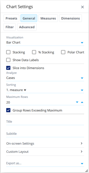
- Visualization: Choose how data is visualized. There are variety of chart types, table, pivot chart and a KPI card available (see more in next chapter. Depending on the visualization, different mappings can be selected for measures/dimensions/columns.
- Stacking: In charts, stacking is used to show series on top of each other, which better visualizes the sum of the measures across different series.
- % Stacking: In charts, percentage stacking shows the measures as percentages of the sum of the measures. The total is thus always 100%.
- Polar Chart: In charts, shows the X-axis as a circular instead of a horizontal line. The polar chart works with many chart types, such as column, line and area charts.
- Show Data Labels: When checked, the measure values are shown next to the data point in charts.
- Group Rows Exceeding Maximum: When enabled and number of rows is limited by the Maximum Rows setting, the extra rows are aggregated into the last row.
- Title: Custom title for a chart or table can be defined that replaces the automatically created title. When this field is empty, an automatically created title is used in charts. Note that the table does not have an automatically created title. To hide the title, a space character can be defined.
- Subtitle: Custom subtitle for a chart that replaces the automatically created subtitle. When this field is empty, an automatically created subtitle is used showing the chart filter (if defined). To hide the subtitle, a space character can be defined.
- On-screen Settings
- Custom Layout: Using the Custom Layout, advanced visual settings for the chart and table can be defined using JSON format. Settings defined here override the default chart and table settings. Overriding is done for individual properties, so only the customized settings need to be specified. See examples for customizing charts.
- Export: Tables, pivot tables and charts can be exported into several formats available in the dropdown list.
Available Visualizations
Chart provides variety of visualization. Here are mentioned some of those:
- Graph: These chart types use low and high mappings.
- Table: The table shows the data in a similar form that it is returned from the server, and thus the table is useful when defining dimensions and measures. In the table, dimensions are first starting from the left and then there are measures. Filters can be created from the table by clicking dimensions/columns (it's not possible to create filter by clicking measures). Also when creating a column filter to the table (which only filters the data in the table), a process mining filter is automatically suggested which can be accepted or ignored. Columns widths can also be changed, and tables are able to remember the adjusted widths.
- Pivot Table: In the pivot table, the first dimension is visualized as rows and the second dimensions is visualized as columns. Measures are as cell values of the pivot table. In addition to the usual table, the pivot table provides changing number of columns depending how many unique values there are in the second dimension.
- KPI Card: The KPI card shows a single KPI value calculated from the whole data, and optionally a color rectangle next to the value to visualize the KPI performance.
- Root Causes: Special visualization for the Root Causes analysis. When using this visualization, also the analyzed objects need to be Root causes.
Analyzed Data
When creating a chart, the first thing to decide, are which items to be analyze. Settings that determine the analyzed data are:
- Analyze: Choose the process mining objects to analyze, e.g. cases, events, variations, event types or flows. Analyzed items can also be limited by a certain criteria. Still, for cases it's recommended to use chart filter if a subset of cases is needed.
- Slice into Dimensions: When checked, data is sliced in to the defined dimensions, and the row count depends on how many unique dimension values there appear in the data. When dimensioning is in use, a single row represents one or several analyzed items. When unchecked, data is not sliced into different dimensions, but each analyzed item is as a separate row in the data. There are thus as many rows as there are analyzed items.
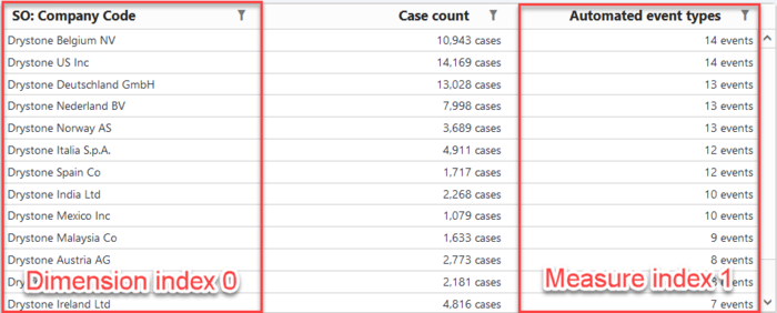
- Sorting: Data can be ordered based on data chosen to the measures/dimensions/columns. Both ascending and descending ordering is available. Sorting can also be disabled if it doesn't have any use, as sorting affects performance when there is large number of rows. Note that for charts having numerical or date X-axis, sorting doesn't have any visible effect, because position of data points in the chart (columns etc.) depend on measure/dimension data values instead of order of rows. When custom is selected, a custom sorting can be defined when clicking the Advanced sorting button as an object array with the follow properties for each object:
- type: either measure or dimension
- index: measure or dimension order number (starts from 0)
- direction: Either ascending or descending
Example:
[
  {
    "type": "measure",
    "index": 1,
    "direction": "descending"
  },
  {
    "type": "dimension",
    "index": 0,
    "direction": "ascending"
  }
]
- Maximum Rows: Number of rows returned are limited to this maximum count. This setting is useful with sorting to show only the most relevant items. In addition, in certain selections there may be a large number of rows, so the maximum should always be limited.
- Analyzed objects sample size: Sampling randomly removes some of the items leaving only the sample size of items left to the analyzed objects. If sample size is not defined, sampling is not used. The purpose of sampling is to improve performance, as there will be less items in the dimension and measure calculation. The intention is that the calculation from the sampled dataset would provide close enough results in statistically high enough probability. Sampling cannot be used in some calculations, because it affects the calculation results.
- Model: Select a process mining model that is shown by this chart. When selecting <used by dashboard>, the model that is currently selected for the dashboard in the header, is used by the chart. This setting allows to create dashboards, where the dashboard at the same time fetches and visualizes data from different models.
Selecting Measures, Dimensions and Columns
When dimensioning is used (Slice into Dimensions setting checked), measures and dimensions can be chosen (in the respective tabs), and when dimensioning is not used, columns can be chosen (in the respective tab).
When dimensioning is used, there can be zero to many dimensions defined. Available dimensions depend on which objects are selected for the analysis (in the Analyze' dropdown list). The calculation returns as many rows as there are unique combinations for each dimensions values. For example, if you dimension by two dimensions, the other containing 3 unique values, and the other 5 unique values, there can be maximum of 3x5=15 rows in the resulting data. Note that all combinations might not appear in the data and thus the number of rows might be less.
When the data is sliced into different dimensions, measures are calculated for each dimension. There can be zero to many measures defined. Measures are typically numerical information as most charts visualize only number, but tables can be used to present any kind of data.
When dimensioning is not used, one to many columns can be chosen. Columns are simple properties or attributes of the listed objects. If showing data in a table, there is one row for each of the analyzed objects.
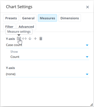
Each measure, dimension and column contain the following buttons when hovering:
- Measure/dimension/column settings: Opens a dialog for the detailed settings that affect only to this measure/dimension/column (see the next chapter).
- Convert to custom expression: Converts the measure/dimension/column to a custom expression for advanced editing. Note that it's not possible to go back, so if need to do that, remove the custom measure/dimension/column and create a new. Tip: When writing custom expressions, it's useful to start with a ready-made measure/dimension/column to get an expression to further edit.
- Move down: Moves this measure/dimension/column one step down and moves the one previously below, one step up (they are switching places).
- Move up: Moves the measure/dimension/column one step up and moves the one previously above, one step down (they are switching places).
- Add measure/dimension/column: Moves this measures/dimensions/columns and all below it one step down to make space for a new one.
- Delete measure/dimension/column: Deletes this measure/dimension/column and moves all others below one step up.
Measure, Dimension and Column Settings
Working with custom expressions
In addition to the ready-made measures, dimensions and columns, you can write your own expression for a custom calculation logic. Custom expressions can be written by selecting the Custom expression item from the list (the last item) and defining the expression to the Expression field. In addition, data type of the expression needs to be defined in the Data type field. The data type must match with the actual data produced by the expression.
In addition, there is the possibility to define Additional root expression which is an expression that is calculated in the entire eventlog's context. The additional root expression can be used e.g. to define a variable to store the eventlog level calculations there, and thus the variable is available in the measure, dimension or column expression.
An easy way to write custom expressions is to start from the ready-made measures, dimensions and columns: find a suitable ready-made item and click the Convert to custom expression button to create a custom expression that is exactly the same as the ready-made measure, dimension or column. You can now edit the expression for your customized need. When writing expressions, it's important to note the context in which each expression is run. Dimensions and columns are run in the individual analyzed object context, and measures in a set of analyzed objects context.
Layout Settings
- Background color: Background color of the chart area.
- Border color: Border color of the chart.
- Border width: Border width of the chart in pixels. When the width is zero, border is not visible.
- Border corner roundness: Border corner roundness in pixels. Zero means sharp corners.
- Color palette: Colors for chart series come from the color palette. When in the static series mode, colors for each y-axis can be overriden in the chart settings.
Filtering Settings
In QPR ProcessAnalyzer, filters can be applied on two levels:
- Entire dashboard: Dashboard filters are applied to all charts in the dashboard and they are visible in the main header. When clicking items in the charts, dashboard filters are created.
- Individual chart/component: Chart filters are applied only to the chart or component where the filters are defined for. Filters for a chart can be viewed and edited in the chart settings. Chart filters can be created from the chart settings. Tip: If the desired type of filter cannot be created from the Add filter dialog, create the filter first as a dashboard filter and then drag and drop the filter rule over the chart. The filter rule is moved as a chart filter.
Chart filters and behavior for the chart filtering is defined in the Filter tab having the following settings:
- Chart Follows Dashboard Filters: When checked, the chart is filtered by the filters in the dashboard. When unchecked, the chart is not affected by filters in the dashboard, and thus the chart is based on data in the entire model.
- Create Filters from Chart: When checked, filters can be created based on selected items in the chart. When unchecked, no filters are created when clicking the chart.
- Update Filter During Selection: When checked, other charts are filtered during selecting items in this chart, enabling to preview filtering results in other charts before confirming the selection. When unchecked, a filter is created only when the selection is confirmed, improving smoothness of usage in large models.
- On-screen Settings Follow Flow Selection: When checked, selecting flows (e.g. in the flowchart) changes accordingly the start and end event types that are as on-screen settings. Note that the start and end event types need to be as on-screen settings, for the automatic fill in to work. When unchecked, the automatic fill in is disabled.
- Chart Filter: Button to add filter rules that affect this chart only. Filter rules can be edited by clicking them and removed from the recycle bin icon. The chart or dashboard component only shows cases and events that match with the defined filter rules. If there are several filter rules defined, all of the individual rules must match.
- Find Root Causes: Rules to select cases used by the root causes analyses to find possible root causes for the phenomena pointed by those rules.
Note that in addition to the process mining filters, objects can be filtered in the chart using the expression language. For that there are many ready-made selections. The process mining filters should be used when when the process mining model should be kept in a consistent state, e.g. filtering event types recalculates variations. Certain kind of filtering is not possible through the process mining filters, and then expression based filtering should be used, e.g. filter events based on event attributes or filtering flow objects.
Advanced Settings
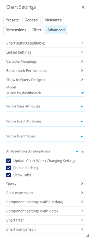
- Chart settings (editable): All settings in a chart are stored in a single entity that are shown here. The settings can also be edited directly. There are validations in place, so invalid settings are not accepted. You can copy chart settings and use them in another chart as follows: Select all JSON and copy it to a clipboard. Go to another chart, paste the settings to the same chart settings textbox and click Save.
- Linked settings
- Variable mappings
- Benchmark performance
- Show in Query Designer: For testing and development purposes, clicking this button starts editing the current expression in the Query Designer view.
- Visible Case Attributes: Only the defined case attributes are shown in settings where case attributes need to be selected from a list. This setting can be used to hide unnecessary case attributes to make lists shorter and easier to use. When no case attributes are defined, all case attributes are shown.
- Visible Event Attributes: Only the defined event attributes are shown in settings where event attributes need to be selected from a list. This setting can be used to hide unnecessary event attributes to make lists shorter and easier to use. When no event attributes are defined, all event attributes are shown.
- Visible Event Types: Only the defined event types are shown in settings where event types need to be selected from a list. This setting can be used to hide unnecessary event types to make lists shorter and easier to use. When no event types are defined, all event types are shown.
- Update Chart When Changing Settings: When checked, the chart is not updated automatically when changing chart settings, but when clicking the Apply button in the General tab. Disabling automatic updating improves performance in large models when changing several settings at the same time.
- Enable Caching: Enable or disable chart data caching both in the client and server side. Caching improved performance as in the second time, data can be quickly retrieved from the cache. Some reports benefit of disabled caching so that the up-to-date data is always retrieved.
- Show Tabs: Shows tabs above the chart to quickly change charts. Tabs are showing the most common presets. When tabs are shown, the chart title is not shown (titles are still shown for tables).
- Query: This option shows the entire query that is sent to the server for calculation. The query contains the expression (the previous option), and in addition other information, such as the model id, filter and comparison.
- Root expression: Shows the root expression in a multi-line format. The root expression is also visible in the expression but there it's encoded to a single line.
- Component settings (without data): Chart uses Highcharts library to draw charts and Syncfusion library to draw tables and pivots. With this options you can see the actual configuration that is used by the visualization component. The visualized data is part of the configuration, but it's removed.
- Component settings (with data): This is similar option as the previous, except the visualized data is also included.
- Chart filter: Shows the chart filter in a JSON format. This only contains the chart filter (not the stored or dashboard filter). Syntax for the filter JSON is described in Filtering Queries.
- Chart comparison: Similar to the Chart filter, except showing the currently selected comparison.
On-screen Settings
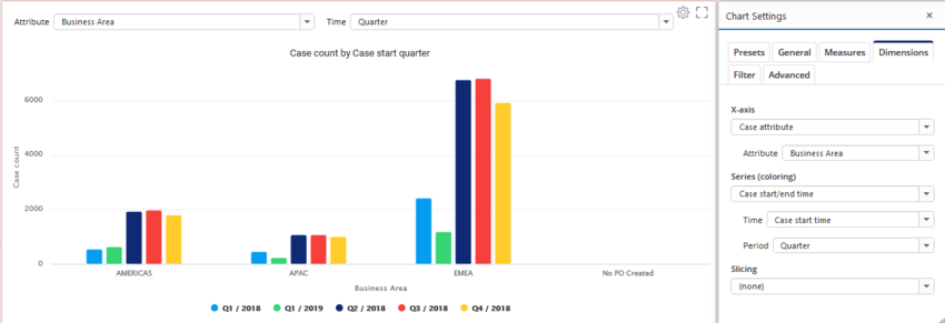
Measure, dimension, column and analyzed objects parameters can be defined as on-screen settings, i.e. the settings are visible above the chart in the dashboard for quick access. On-screen settings are defined as a JSON array, where each item is an object with following properties:
- type: Either measure, dimension or root. If slicing into dimensions is disabled, columns correspond to dimensions.
- index: Index of the measure, dimension or column starting from zero.
- parameter: Name of the parameter.
- label: Custom label for the setting.
- maxWidth: Maximum width of the shown setting in pixels.
- newLine: Defines whether the setting is positioned to a new line for more spacing between settings.
- control: UI control type which is one of the following: singleselectlist, dynamicsingleselectlist, multiselectlist, singlelinetext, multilinetext, numericfield, datefield, datetimefield, checkbox, bpmneditor or colorpicker.
- mandatory: Defined that the UI control is mandatory, i.e. the chart is not drawn until a value has been specified.
- defaultValue: Default value used when the chart is opened. Note that when a UI control is mandatory and there is not default value, the chart is not drawn until a value has been specified.
- minValue: For numericfield, specified the minimum allowed numerical value.
- maxValue: For numericfield, specified the maximum allowed numerical value.
- allowDecimals: For numericfield, specified whether decimal numbers can be specified (or only integer numbers).
- escape: Defines whether the value is escaped for string literals (" -> \" and \ -> \\). Escaping is needed when the value is used in an expression in a string literal.
- trueValue For checkbox, defines the value to be used when the checkbox is checked.
- falseValue: For checkbox, defines the value to be used when the checkbox is unchecked.
- updateImmediately: For numericfield and singlelinetext, specified whether the chart is updated with each change of the input box value. When disabled, the value updated only when cursor leaves the input box.
Example:
[
  {
    "type": "dimension",
    "index": 0,
    "parameter": "Attribute",
    "maxWidth": 500
  },
  {
    "type": "dimension",
    "index": 1,
    "parameter": "Period",
    "label": "Time"
  }
]
Variable mappings
Setting are for binding dashboard variables to chart settings, meaning that chart settings are changed when variables are changed. It's possible for example to add a drop-down list component, bind the list to a dashboard variable, and then bind the variable to settings in several charts. When using dashboard variables, the used variables need to be defined in the Dashboard Properties dialog in the Variables tab, so that the initial values of the variables are stored to the dashboard. Note that dashboard variables can be used in custom expressions using tags without specifying them in the variable mappings. Variable mappings are configured as an array of mappings where each item is an object with the following properties:
- variable: Name of the bound dashboard variable.
- type: One of the following type of chart setting: measure, dimension, root (for the Analyze list parameters), generic (all other settings in chart), filter (to map to chart filter).
- index: When type is a measure or dimension, the order number of the measure/dimension (starts from 0).
- parameter: Name of the chart setting or parameter to bind to.
- filterType: When type is filter, define the filter type as IncludeCases, ExcludeCases, IncludeEventTypes or ExcludeEventTypes.
- ruleType: When type is filter, define the rule type as one of the following: CaseAttributeValue, EventAttributeValue, EventType or Case.
- attribute: When type is filter and ruleType is CaseAttributeValue or EventAttributeValue, define the case/event attribute name.
[
  {
    "variable": "CaseAttributeVariable",
    "type": "measure",
    "index": 0,
    "parameter": "Attribute"
  },
  {
    "variable": "EventTypes",
    "type": "filter",
    "filterType": "IncludeEventTypes",
    "ruleType": "EventType"
  }
]
Linked settings
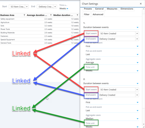
Settings are for linking settings or parameters within a single chart. When configured, the linked settings are kept in synchronization, i.e. when any of the settings is changed, other linked settings are also changed. Linked settings are configured as an array of setting groups which are array of objects. Each object points to an individual setting using the following properties:
- type: One of the following type of chart setting: measure, dimension, root, generic, tag.
- index: When type is a measure or dimension, the order number of the measure/dimension (starts from 0).
- parameter: Name of the chart setting or parameter.
- tagName: When type is tag, defined the linked tag name. The tag can be used in custom expression similar to variables.
Example:
[
	[
		{
			"type": "measure",
			"index": 0,
			"parameter": "Start event"
		},
		{
			"type": "measure",
			"index": 1,
			"parameter": "Start event"
		}
	],
	[
		{
			"type": "measure",
			"index": 0,
			"parameter": "End event"
		},
		{
			"type": "measure",
			"index": 1,
			"parameter": "End event"
		}
	],
	[
		{
			"type": "measure",
			"index": 0,
			"parameter": "Time unit"
		},
		{
			"type": "measure",
			"index": 1,
			"parameter": "Time unit"
		}
	]
]
Benchmark performance
Clicking the Benchmark performance buttons starts a performance benchmark run for the chart, which measures the time taken for the server to calculate and return the required data for the chart. Benchmarking is useful when for example creating custom expressions and finding the most optimal way of writing them. The benchmark runs the calculation multiple times to reduce effect of random variation in the measurement. When the benchmark run is completed, the following information is shown:
- Benchmark result (shown as bolded) (calculated as a median time of the individual measurements)
- Variation in the benchmark measurement (calculated as a standard deviation of the individual measurements divided by the benchmark result)
- Difference to the previous benchmark result
- List of all individual measurements (abandoned are greyed out)
The highest individual measurements (approximately 40%) are abandoned from the calculation and shown as greyed out, because the highest measurements are usually result of the random variation.
The history of benchmark runs done for the chart are preserved until the dashboard is closed.
