QPR ProcessAnalyzer Table: Difference between revisions
m (Ollvihe moved page QPR ProcessAnalyze Table to QPR ProcessAnalyzer Table without leaving a redirect) |
No edit summary |
||
| Line 41: | Line 41: | ||
* Orange: #FEA88A (Durations) | * Orange: #FEA88A (Durations) | ||
* Yellow: #FFD851 (Value/Cost) | * Yellow: #FFD851 (Value/Cost) | ||
===Traffic lights=== | ====Traffic lights==== | ||
Use case: KPIs based on traffic light signaling | Use case: KPIs based on traffic light signaling | ||
Revision as of 10:23, 9 September 2020
Table conditional formatting can be used to define table cell background colors, text colors, colored icons and databar, where all depend on the data in the table.
Table Functionalities
Conditional Formatting
Conditional formatting is defined in the measure/dimension/column settings as a JSON object with following allowed properties:
- backgroundColor
- rules: Rules are checked in the defined order and the first matching determines the color.
- color: color to use when the rule matches.
- value: Value to compare against.
- comparison: One of the following: <, >, <=, >=, ==, !=
- scale
- color: Color that corresponds with the value.
- value: Value that corresponds with the color.
- color: Fixed color that is used when no rules/scale is defined or there are no matching rules.
- rules: Rules are checked in the defined order and the first matching determines the color.
- textColor: Same settings can be used as in the backgroundColor.
- databar
- min: Value that represents the databar minimum position (i.e. when databar is not visible).
- max: Value that represents the databar maximum position (i.e. databar fills the whole cell).
- color: Color of the databar. Default color is #4bc3ff.
- icon
- rules: Similar syntax can be used as in the color rules, except instead of "color" there is "icon" attribute to define the icon. All Google Material Icons are available: https://material.io/resources/icons/.
- color: Color of the icon. Default color is #333333.
Rule value property and scale minimum and maximum can be defined:
- fixed value, e.g. 5
- aggregate of the same column data, e.g. { "aggregate": "max" }
- aggregate of another column data, e.g. { "type": "measure", "index": 1, "aggregate": "max" }
- refer to a cell value in other column in the same row, e.g. {"type": "measure", "index": 1 }
Available aggregations are: min, max, sum, average, median, first, last.
Templates
Below are listed the examples used in dashboards with their respective use cases and Conditional formatting expressions. The recommended colors and their color codes are as follows:
- Green: #68DD8F (Positively correlating KPIs)
- Red: #EF5254 (Negatively correlating KPIs)
- Blue: #4BC3FF (Case/Event counts)
- Dark blue: #0F55A5 (Automation)
- Orange: #FEA88A (Durations)
- Yellow: #FFD851 (Value/Cost)
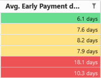
Traffic lights
Use case: KPIs based on traffic light signaling
{
  "backgroundColor": {
    "rules": [
      {
        "color": "#EF5254",
        "value": 10,
        "comparison": ">="
      },
      {
        "color": "#FFD851",
        "value": 6.5,
        "comparison": ">="
      },
      {
        "color": "#68DD8F"
      }
    ]
  }
}
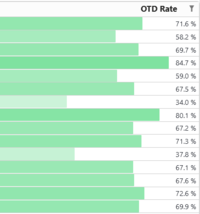
Green databar
Use case: KPIs where 100% is a desired value, eg. On-Time Delivery
{
	"databar": {
		"min": 0,
		"max": { "aggregate": "max" },
		"color": {
			"scale": [
				{
					"value": 0,
					"color": "#FFFFFF"
				},
				{
					"value": { "aggregate": "max" },
					"color": "#68DD8F"
				}
			]
		}
	}
}
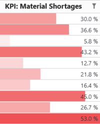
Red databar
Use case: KPIs where 0% is the desired value and you want to highlight the worst performers of this metric, eg. Material shortages
{
	"databar": {
		"min": 0,
		"max": { "aggregate": "max" },
		"color": {
			"scale": [
				{
					"value": 0,
					"color": "#FFFFFF"
				},
				{
					"value": { "aggregate": "max" },
					"color": "#EF5254"
				}
			]
		}
	}
}
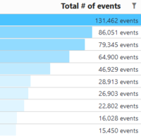
Blue databar
Use cases: Case/event counts
{
	"databar": {
		"min": 0,
		"max": { "aggregate": "max" },
		"color": {
			"scale": [
				{
					"value": 0,
					"color": "#FFFFFF"
				},
				{
					"value": { "aggregate": "max" },
					"color": "#4BC3FF"
				}
			]
		}
	}
}
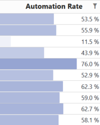
Dark blue databar
Use case: Automation rate and similar metrics that scale 0-100%
{
	"databar": {
		"min": 0,
		"max": { "aggregate": "max" },
		"color": {
			"scale": [
				{
					"value": 0,
					"color": "#FFFFFF"
				},
				{
					"value": { "aggregate": "max" },
					"color": "#7588C4"
				}
			]
		}
	}
}
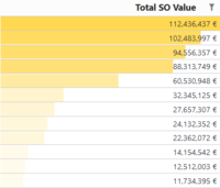
Yellow databar
Usecase: Monetary KPIs such as cost/value
{
	"databar": {
		"min": 0,
		"max": { "aggregate": "max" },
		"color": {
			"scale": [
				{
					"value": 0,
					"color": "#FFFFFF"
				},
				{
					"value": { "aggregate": "max" },
					"color": "#FFD851"
				}
			]
		}
	}
}
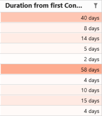
Orange scale
Use case: Durations
{
  "backgroundColor": {
    "scale": [
      {
        "value": {"aggregate": "max" },
        "color": "#fea88a"
      },
      {
        "value": {"aggregate": "min" },
        "color": "#FFFFFF"
      }
    ]
  }
}
Other examples
Background color is based on a color scale where column minimum value zero gets color #FFFFFF and maximum value #FFD851. Color is scaled linearly between these colors.
{
	"backgroundColor": {
		"scale": [
			{
				"value":  0,
				"color": "#FFFFFF"
			},
			{
				"value": { "aggregate": "max" },
				"color": "#FFD851"
			}
		]
	}
}
Similar to previous example, except minimum and maximum values come from another column (measure number 1).
{
	"backgroundColor": {
		"scale": [
			{
				"value": { "type":"measure", "index": 1, "aggregate": "min" },
				"color": "#FFFFFF"
			},
			{
				"value": { "type":"measure", "index": 1, "aggregate": "max" },
				"color": "#FFD851"
			}
		]
	}
}
The following setting defines a fixed background color for a column.
{
	"backgroundColor": {
		"color": "#FFD851"
	}
}
Background color code is taken from column measure 1 from the same row.
{
	"backgroundColor": {
		"color": { "type":"measure", "index": 1 }
	}
}
Text color is #FF0000 if value is lower than 20, otherwise #00FF00.
{
	"textColor": {
		"rules": [
			{
				"color": "#FF0000",
				"value": 20,
				"comparison": "<"
			},
			{
				"color": "#00FF00"
			}
		]
	}
}
Creates a red-white-green color scale where the minimum value is red, the nominal value (eg. a target value) of 50 is white and maximum value is green.
{
  "backgroundColor": {
    "scale": [
      {
        "value": { "aggregate": "min" },
        "color": "#EF5254"
      },
      {
        "value": 50,
        "color": "#FFFFFF"
      },
      {
        "value": { "aggregate": "max" },
        "color": "#68DD8F"
      }
    ]
  }
}
Adds an icon left of the value (icon sentiment_satisfied_alt if value is over 100 and otherwise sentiment_very_dissatisfied). Also icons have different colors.
{
	"icon": {
		"rules": [
			{
				"icon": "sentiment_satisfied_alt",
				"value": 100,
				"comparison": ">"
			}
		],
		"icon": "sentiment_very_dissatisfied",
		"color": {
			"rules": [
				{
					"color": "#36d475",
					"value": 100,
					"comparison": ">"
				},
				{
					"color": "#EF5254"
				}
			]
		}
	}
}
